Tuesday, 12 April 2011
WEEK 17 - PRESENTATION FEEDBACK
Feed back from my main task ,was that I had followed convention of how a newspaper should be through the use of the black and white them ,because all newspapers are have the back and white theme. Also my advertisement where the classifield is, followed conventions ,because it was a car adverts, which you normally see in most newspaper . However my newspaper was criticised in the aspect of the advertisement not being as regular adverts would be, because there is only a advert of a car, most tend to have more advertisement.

WEEK 16
Below is the final design of my poster,which i created in In-Design. i had to copy my template from my previosius front coveer onto my poster,because its essential to have your nameplate ,from the reasearch i did. then i had to come up with a cathy phrase 'GRAB YOUR COPY NOW'. However theleadline is the most important and the photo being used because this is the main focus theaudience wold be concentrating on,so it had to be a headline that appeals to my target audience.
whilst trying to come up with an idea of what my headline should be, i decided i wanted it to relate to my front cover artcle headline so i ended up with 'AIDS RISING RAPIDLY IN YOUNG TEENS'. this was because my front cover article was about a young teenager who had been diagnosed with Aids.

whilst trying to come up with an idea of what my headline should be, i decided i wanted it to relate to my front cover artcle headline so i ended up with 'AIDS RISING RAPIDLY IN YOUNG TEENS'. this was because my front cover article was about a young teenager who had been diagnosed with Aids.

WEEK 15 - Ancilary task part 1
Here is a mood board for my first ancilary task which is newspaper posters ,that i have gathered while researching..

Here is a mood board of different local newspaper posters, as you can see the posters are mostly of text,written in bold ,with their name plate above. So with all of this research i would be able to conclude how my poster is going to come out. However looking at 'the sun' newspaper poster it not only features text but it has an image tends to be more different as this is a what i would like to layout my poster.
i further went on to produce a questionaire to see what, my audience would like to see on the poster of my newspaper article . Below is the questionaire from asking 10 people .

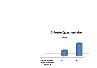
 From my questionare, majority want text and image on the poster, because both would draw their attention,however not a lot of people from my questionaire results, realy read newspaer posters. this has ledt me to conclude that my poster would contain both text and image as it appeals to the audience. Below is a picture of my template for my poster,whch was designed in Indesign,i decided import an image onto it,which challenges the conventions of a poster.


Here is a mood board of different local newspaper posters, as you can see the posters are mostly of text,written in bold ,with their name plate above. So with all of this research i would be able to conclude how my poster is going to come out. However looking at 'the sun' newspaper poster it not only features text but it has an image tends to be more different as this is a what i would like to layout my poster.
i further went on to produce a questionaire to see what, my audience would like to see on the poster of my newspaper article . Below is the questionaire from asking 10 people .


WEEK 14


This is two template layout on how my inside page could look,after researching other local inside page article,i decided to draw out a ,layout of how i would want my inside page to look like ,so that is what is shown above.
My name plate is going to be in the top right hand corner, while the page number would be in the top left, my article is going to be seperated into to columns, then a side bar on the right hand side,with my colour photo on the left hand side and lastly my classfields at the bottom of the page.
Sunday, 10 April 2011
WEEK 13

I had to make changes with the headline,because previously ,my newspaper and nameplate had the same text,but whilst researching i found out that this barely happens,so i made immediate changes so that my nameplate can stand out morerather than my headline and nameplate looking the same.
So i changed the 'headline' to 'times new roman' not to sophisticated,just simple,but also attractive.


WEEK 12

This is my official local newspaper. its very similar to my first layout,hardly anything has changed between the two layouts, the only difference ,like i have pointed out previously,is the classfield ,how i substituted one of the advertisment,to a community promotion to benifit the local community.
WEEK 11
This is the adverts i have decided to use for the front cover of my magazinze
This is a car advertisment :
CAR SALE £2000
including M.O.T
Call: 0845 456 321
This here is a slowgan to the community which relaltes to the picture of the bin.
'help the community by recycling waste products '


As shown above a few changes had been made compared to the template of my classfield,in the sense it is only promoting one advertisment ,and the other is just a local community promotion telling people to keep the community clean by recycling .
In my research ,its rare to find such promotion on a local newspaper,telling the community to keep environment clean,but i wanted my newspaper to be different in tht aspect, also due to the fact my local newspaper is new,it could be highlighted as a key point as to why it can be seen as different to other local newspaper.
I decided to put my adverts at the bottom of my front cover because,from my research i found out that most newsper adverts tend to be at the bottom,therefore my newsopaper meets conventions of newspaper,because most classfield are normally at the bottom of the page.
This is a car advertisment :
CAR SALE £2000
including M.O.T
Call: 0845 456 321
This here is a slowgan to the community which relaltes to the picture of the bin.
'help the community by recycling waste products '


As shown above a few changes had been made compared to the template of my classfield,in the sense it is only promoting one advertisment ,and the other is just a local community promotion telling people to keep the community clean by recycling .
In my research ,its rare to find such promotion on a local newspaper,telling the community to keep environment clean,but i wanted my newspaper to be different in tht aspect, also due to the fact my local newspaper is new,it could be highlighted as a key point as to why it can be seen as different to other local newspaper.
I decided to put my adverts at the bottom of my front cover because,from my research i found out that most newsper adverts tend to be at the bottom,therefore my newsopaper meets conventions of newspaper,because most classfield are normally at the bottom of the page.
Subscribe to:
Posts (Atom)